digital painting
Monday, June 19, 2017
Thursday, June 15, 2017

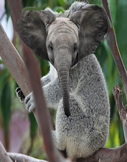
Hybrid Animal
I think the strongest part of my visual is combining the 2 animals together. The elephant ears was such a good idea for the koala head because the shape fit so perfectly. I think I did an amazing job on the blending of the elephant and the koala. That is the most important part in the process because if you don’t blend and don’t use the layer mask it would look like you photo shopped. I changed the blend modes of the heads . The tools I used in this project was mainly the stamp and the layer mask. The layer mask is always so useful when you want to draw over something. It is less work than painting because you just erase whatever you don’t need. I used the stamp on the other hand because the size. I didn’t want to stretch the image out so I lowered the picture then stamped area and shaded in the color to make it look more as the surrounding. This whole activity was kind of easy to me. I don’t think there was a difficult part to this activity. If I could do this activity again I would change the animals. I would rate my effort on this a 7 because I hadn't added another animal.
Tuesday, May 30, 2017
pop art
The
strongest part of my visual are the colors that bring a cool and calm look. I
could’ve improved on making the colors by using the filter gallery and change
the numbers of levels or edge simplicity and fidelity. But I also believe that
the shading shows definition of the photo and emphasizes the act of the pop
art. The tools I used were the crop tool to size my picture, the filter gallery
to adjust the sliders and get the 3 different values of grey within the picture,
the page icon to make a new blank layer and the paint brush tool to pick a
color and paint. I believe the easiest part of this project was bringing in my
4 images together and making one image. The most difficult part about this
project was using the magic wand tool it had kept confusing me and allowed me
to merge colors that shouldn’t have been merged together. I demonstrated the
goal of Andy Warhol’s project as a mixture of my own creation. If I could do
this project again I would fill in the little blanks I left out. Out of a 1-10
I’ll give myself an 8 for the creative idea and the little mistakes left out
for not a perfect 10.
Monday, April 10, 2017
kaleidoscope
The
strongest part of my visual art piece is the illusions that bring an effect to
the viewer’s eye. I could’ve improved on adding more colors and giving it a
vibrant look. The tools I used to create my three kaleidoscope were first the
rulers horizontally and vertically to line up the original image and to make
them symmetrical. I also used the polygon lasso tool to erase parts of the
image or select a certain thing. The easiest part of the kaleidoscope project
is the creative thought, because the kaleidoscope allows you to choose from
variation of ideas from Photoshop. The most difficult part of this project was
trying to gather all the pieces and putting it together as making your original
photo look like something it wasn’t before. If I could do this project again I
would use my time more wisely and add more filters from observing my peers
projects. On a scale from 1-10 and 10 being the highest I would grade my
project a 7 because it wasn’t the best I’ve could’ve done a little better but I
had waste a lot of my time just dosing off and getting off topic. All in all I
hadn’t tried my best but it hadn’t come out as bad as I expected it to be.
Thursday, March 2, 2017
Subscribe to:
Comments (Atom)


